Beyond Light & Dark: Introducing a Balanced Theme System with Real-Time Preview
4 min read
Enhanced Theme Customization System for Web Applications
Traditional light and dark mode toggles in design systems offer a basic level of user theming, but they often fall short of providing genuine user control over the visual balance and feel of an interface. This new system, built with Tailwind CSS v4 and shadcn/ui, moves beyond this binary approach, empowering users to fine-tune the core color dynamics of an application in real-time. Crucially, this is achieved without requiring a color picker and while maintaining WCAG contrast compliance.
The Problem with Light/Dark Toggles
Light/dark toggles function as predefined themes. While convenient, their inherent limitations restrict the ability to cater to specific brand nuances, individual user comfort levels, or diverse visual expression preferences. This often locks users into a narrow set of aesthetic choices.
The development of this new system was driven by the need for:
- A secure and accessible method to offer enhanced theme flexibility.
- A customizable framework grounded in OKLCH color science for more perceptually uniform color adjustments.
- A client-side solution that respects initial render constraints, is SEO-friendly, and prioritizes performance.
The Balanced Theme System: In-Depth
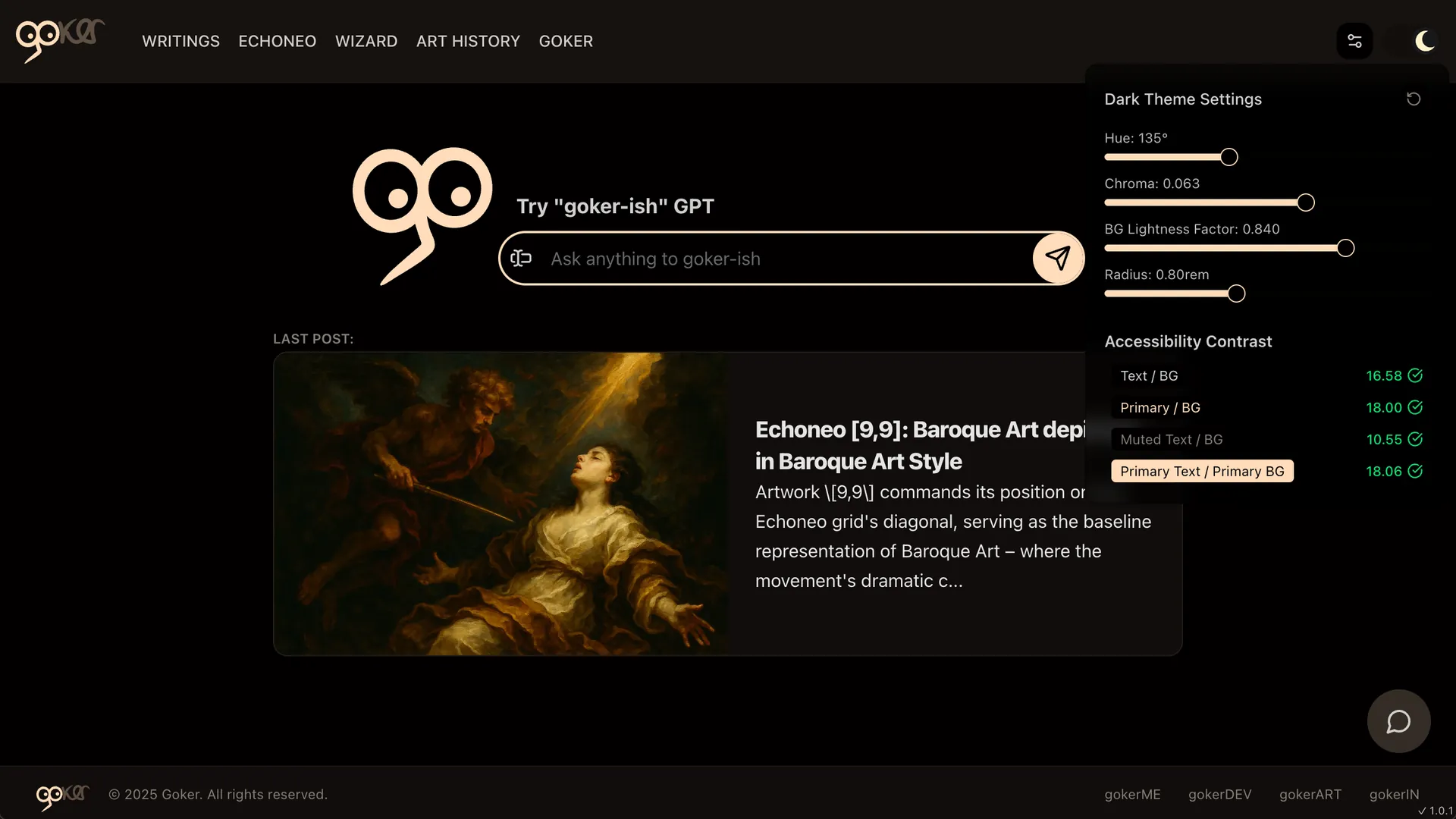
This system introduces a minimalist yet powerful interface featuring four intuitive sliders:
Hue Shift: Allows users to shift the base theme tone across the color spectrum (0-359 degrees).Chroma: Adjusts the saturation or intensity of the colors (ranging from 0.001 to 0.1).Contrast(BG Lightness Factor): Controls the perceived brightness by adjusting background lightness (slider values from 0.5 to 0.95).Radius: Modifies the roundness of components (0 to 2rem).
This approach, devoid of manual color pickers or complex overrides, leverages color theory and user-centered ergonomics to deliver a refined customization experience.
Technical Details & Functionality:
- OKLCH Color Space: The system utilizes the OKLCH color space, which is designed to be more perceptually uniform. This means that changes in color values correspond more closely to how humans perceive changes in color.
- Dynamic Token Generation: Theme configurations, based on slider inputs, dynamically generate a comprehensive set of CSS custom properties (tokens). These tokens define colors for various UI elements like background, foreground, primary and secondary elements, cards, popovers, borders, inputs, and even chart colors.
- Client-Side Application: Changes are applied instantly on the client-side by updating these CSS custom properties on the root HTML element.
- Persistence with
localStorage: User customizations are saved inlocalStorageunder the keyuser-theme-modes. These settings are scoped independently forlightanddarkmodes, allowing for distinct preferences for each. - Snapshot and Hashing for CSS Updates: The system employs an intelligent snapshot mechanism. It stores a snapshot of the original theme values derived from the CSS (
original-theme-modes-snapshotinlocalStorage). If the global CSS files (global.css) are updated later, the customizer detects these changes by comparing the current CSS-derived values with the stored snapshot. If discrepancies are found, it notifies the user and offers to reset the customizations for the affected mode, ensuring that user themes can be re-baselined against new foundational styles. - Theme Switching: A
ThemeSwitchercomponent manages the toggling between light and dark modes. It checkslocalStoragefor a saved theme preference or defaults to the user's operating system preference. When the theme is changed, it updates thedarkclass on the HTML document element and dispatches a customthemeChangeevent, allowing other components like theThemeCustomizerButtonto react and display settings for the currently active mode. - Lazy Loading for Performance: The
ThemeCustomizerButtonis lazy-loaded, meaning it's only downloaded and rendered when needed, which helps in optimizing initial page load performance.
Accessibility Built In
A core tenet of this system is its commitment to accessibility. Unlike rudimentary theme editors, this tool actively computes and displays WCAG contrast ratios in real-time for critical UI pairings:
- Text vs. Background
- Primary vs. Background
- Muted Text vs. Background
- Primary Text vs. Primary Background
Pass/fail indicators (AA and AAA levels) are shown live, guiding users to make choices that maintain readability and usability for everyone. The contrast calculation involves:
- Parsing OKLCH color strings to extract Lightness (L), Chroma (C), and Hue (H) values.
- Converting OKLCH values to the Oklab color space.
- Transforming Oklab values to linear sRGB values.
- Converting linear sRGB to standard sRGB.
- Calculating relative luminance for each color.
- Finally, determining the contrast ratio between two luminances.
Try it Live
A first prototype of this theme customizer is available on goker.me.
It can be integrated into projects using shadcn/ui via the shadcn CLI:
npx shadcn@latest add https://goker.dev/r/theme-customizer.json