Typography Architecture on the Web
7 min read
A few days ago, I hit the image optimization limit on my Vercel Hobby plan. For a brief moment, I was this close to spinning up an imageproxy setup.
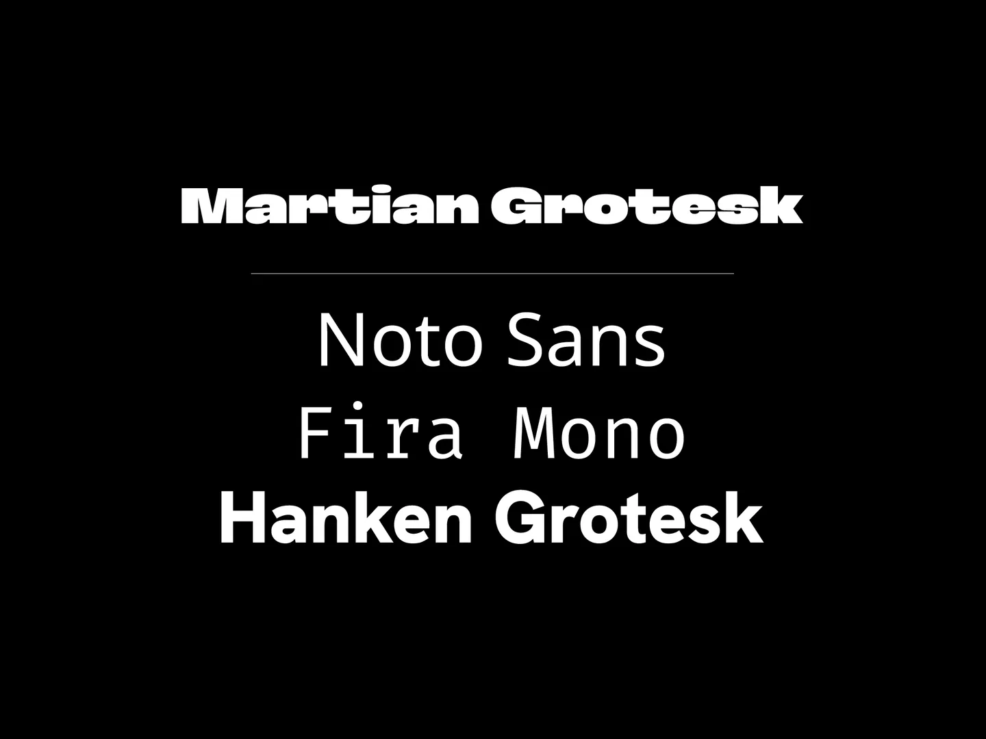
I opened the docs, started scanning through, and then saw it: an extremely bold “Martian Grotesk” in the header. It looked gorgeous. Meanwhile, I’d been happily cruising along with Geist for months — no complaints, just defaulting to the safe option.
Instantly, my brain went: “Okay, time for a font refresh.”Small problem: “Martian Grotesk” doesn’t exist under Google Fonts. So while hopping between other grotesk families in the sidebar, I noticed a section called “Noto” and clicked it almost absentmindedly.
That click turned into a rabbit hole about typography architecture, global character coverage, and how much we actually underestimate fonts in web apps.
(P.S. I just upgraded to Vercel Pro and never set up imageproxy in the end.)
Why “Noto” and a Layered Font Stack?
In the developer world, font choice is usually treated as a visual afterthought — something you touch at the very end of the project. You import Inter via next/font/google, set it as the default sans-serif, or you follow Vercel’s new standard and pick Geist. Quick, easy, common.
But if you want a more design-aware and inclusive approach, typography needs to be treated as part of the application architecture, not just a CSS tweak. The font you choose shouldn’t only look nice; it should also be:
- robust,
- globally compatible, and
- purpose-driven.
In this post, I want to go a bit beyond the usual defaults and talk about designing a font architecture on purpose: where popular choices like Geist and Inter start to hit their limits, and why a combination like Noto + Hanken Grotesk (plus a good mono) can be a more strategic choice.
Section 1: Industry Defaults (Inter and Geist)
Most modern tech blogs and SaaS dashboards rely on one of these two fonts:
Inter
Inter is the de facto standard of the industry. It’s built specifically for screens and keeps text highly readable even at small sizes. It’s also carefully tuned for confusing characters like l, I, and 1, making them easier to distinguish.
For UI, Inter is a safe and solid choice.
Geist
Geist is Vercel’s new font family. It has a technical, slightly monospaced-ish feel and a very modern structure. It shines in dashboards and interfaces where you want the tech vibe to be front and center.
The Shared Limitation: Specialization
Both fonts have one important constraint: they are specialized.
Inter and Geist are fantastic at rendering the Latin alphabet (A–Z plus extended Latin like Turkish characters). But once your project grows into a global, data-heavy product, that specialization can start to show its cracks.
Your app is no longer just your headings and labels. It’s also whatever the users type in — in any language, with any symbol.
Section 2: The “No Tofu” Philosophy and Global Coverage
A real-world app isn’t only the text you wrote as a developer. It’s also:
- user comments,
- names in different scripts,
- emojis,
- and random mathematical or technical symbols.
Maybe a user drops a comment in Japanese: こんにちはAnother one pastes a formula containing ∯.
If your font doesn’t include a glyph for that character, the browser falls back to the infamous empty square box. In typography slang, those boxes are called “tofu.”
When you see tofu, it’s not just a cosmetic glitch. It’s a sign that your application fails to render the data it’s receiving.
Inter or Geist, when facing unsupported alphabets (Greek, Cyrillic, Japanese, etc.) or certain symbols, may:
- produce tofu, or
- silently fall back to the browser’s default font — often visually inconsistent with the rest of your UI.
The Solution: “No Tofu” → Noto
Google’s Noto project is literally named after the goal of “No Tofu.”
Its mission: provide a single, coherent font family that covers all scripts, languages, and symbols in Unicode as consistently as possible.
Using Noto Sans isn’t just an aesthetic choice. It’s an architectural decision:
“My application must render any data, in any language, without breaking.”
With Noto Sans as your base, you’re effectively saying: Global input is a first-class citizen.
Section 3: A Professional Font Stack
Noto Sans is technically excellent and extremely safe. But as a brand font, it can feel a bit too neutral. If you want personality and visual identity, relying on Noto alone isn’t always enough.
The solution is to avoid a single-font mindset and instead design a font stack where each font has a clear responsibility.
Here’s the architecture I recommend:
1. Body Font (Content Layer): Noto Sans
Role:Paragraphs, lists, menus, and all general text content.
Why Noto?
- High readability.
- Massive global character support.
- It guarantees data integrity: whatever comes in (Japanese, Greek, emoji, symbol), your UI won’t crumble.
Noto Sans is the structural backbone of the typography system.
2. Display Font (Identity Layer): Hanken Grotesk
Role:Headings (h1, h2) and prominent emphasis areas.
Why Hanken Grotesk?
When Noto stays neutral, Hanken Grotesk steps in with character. Its bold and black weights provide a modern, confident display look — perfect for titles, hero sections, and components where you want the interface to feel branded rather than purely functional.
You can think of it as:
“Noto handles all the languages; Hanken handles the attitude.”
3. Mono Font (Technical Layer): Fira Mono
Role:Code blocks and technical text.
Why Fira Mono?
- Designed for code readability.
- Minimizes confusion between
0/Oor1/l. - Familiar and trusted in dev environments.
A good mono font is less about branding and more about preventing bugs and eye strain.
Putting It Together: Architecture, Not Just Styling
When you combine:
- Noto Sans for body,
- Hanken Grotesk for headings,
- Fira Mono for code,
you end up with a layered typography architecture:
- The UI can handle any global text you throw at it (Noto).
- The brand still has a distinct visual voice (Hanken).
- The technical details stay super readable (Fira).
Font choice stops being a “nice to have” and becomes a real UX and data integrity decision.
Next.js and Tailwind CSS Integration
Let’s look at how this architecture maps into a real-world Next.js (App Router) + Tailwind setup.
1. app/layout.tsx – Loading the Fonts
We start by using next/font/google to load and optimize the fonts, then expose them as CSS variables.
import type { Metadata } from "next";import { Noto_Sans, Hanken_Grotesk, Fira_Mono } from "next/font/google";import "./globals.css";// Body font: Noto, with a trimmed set of weightsconst sans = Noto_Sans({variable: "--font-custom-sans",subsets: ["latin-ext"],weight: ["100", "400", "600", "800"],display: "swap",});// Mono font: a single weight is enough for codeconst mono = Fira_Mono({variable: "--font-custom-mono",subsets: ["latin"],weight: ["400"],display: "swap",});// Display font: heavy weight for strong headingsconst display = Hanken_Grotesk({variable: "--font-custom-display",subsets: ["latin-ext"],weight: ["900"],display: "swap",});export const metadata: Metadata = {title: "Font Architecture Example",description: "A layered font stack with Noto, Hanken, and Fira.",};export default function RootLayout({children,}: Readonly<{children: React.ReactNode;}>) {return (<htmllang="en"className={`${sans.variable} ${mono.variable} ${display.variable}`}><body className="font-sans antialiased">{children}</body></html>);}
2. global.css – Mapping to Tailwind
With Tailwind v4, you can map these font variables directly in global.css using the new @theme API instead of wiring everything through tailwind.config.ts. This keeps your font architecture close to your base styles while still giving you semantic utilities like font-sans, font-display, and font-mono.
@import "tailwindcss";@custom-variant dark (&:is(.dark *));@theme inline {--font-sans: var(--font-custom-sans), system-ui, -apple-system, sans-serif;--font-mono: var(--font-custom-mono), ui-monospace, SFMono-Regular, monospace;--font-display: var(--font-custom-display), system-ui, sans-serif;}
Usage Example
Now, anywhere in your app, you can rely on a small, predictable set of font utilities:
export default function Page() {return (<main className="p-10">{/* Heading font (Hanken) */}<h1 className="font-display text-4xl font-black mb-4">Hello World</h1>{/* Body font (Noto) – already default via font-sans, but explicit here */}<p className="mb-6 text-gray-700">This text is rendered with Noto Sans. Japanese characters are noproblem at all: こんにちは.</p>{/* Code font (Fira Mono) */}<pre className="font-mono bg-gray-100 p-4 rounded">const example = "Fira Mono";</pre></main>);}
Closing Thoughts
Most of the time, font choice gets reduced to:
“Just pick Inter or Geist and ship it.”
That works — until your app becomes more global, more data-heavy, or more brand-conscious.
At that point, typography isn’t just about how the UI looks, but:
- how reliably it renders any user input, and
- how clearly it communicates your product’s personality.
By treating fonts as layers in an architecture (Body, Display, Mono) instead of a single toggle in globals.css, you get:
- global safety (Noto),
- strong visual identity (Hanken),
- and clean technical readability (Fira).
And yes, all of this started because a random “Martian Grotesk” header in a doc page distracted me from setting up an image proxy.
Deep Dives & References
- Noto on Google Fonts – Explore the full Noto family, scripts, and subsets: https://fonts.google.com/noto
- Evil Martians – Martian Grotesk – The type family that started this rabbit hole: https://github.com/evilmartians/grotesk
- Next.js
next/fontDocs – Official reference for using local and Google fonts in Next.js: https://nextjs.org/docs/pages/api-reference/components/font